


 English (pdf)
 Article in xml format
 Article references
 Send this article by e-mail
 Cited by SciELO
  Cited by Google
  Similars in
SciELO
Similars in
SciELO  Similars in Google
 Permalink
1. INTRODUCTION
In probability theory the functions called copulas can to represent distribution functions and they are a convenient way to model the dependence structure of random variables [1]. This concept allows building models beyond the standards in the analysis of dependence among variables, further, allows to capture non-linear dependence relationships and only need to specify the copula and marginal function associated with the random variables involved [3].
Before starting to fit models to a set of random variables, an analysis of the type and degree of dependence among them should be realized. In statistics, descriptive and graphical analysis plays an important role because it is the basis for realize and propose more complex models.
To study the dependence among variables some graphical methods like the X-plot and the K-plot (Kendall plot) have been developed. The former was initially proposed by [4] and the latter was proposed by [5]. Some applications of these methods can be found in [6] where the relationship between oil price variation and stock indices is measured, in [7] where the relationship between storm characteristics are analyzed, and in [8] where the dependence between the infiltration index and the maximum rainfall intensity in an hydrological application.
In this paper both graphical methods are analyzed and compared through a simulation study with the traditional scatter plot. In particular we study the effect of some factors that can affect the performance of the dependence graphs.
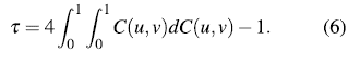
This paper is organized as follows. Section 2 introduces the concept of copulas and the parameter of dependence used in this work, the Kendall's t, its most relevant properties and its form according to the copula used. Section 3 presents the definitions of the graphical methods to detect dependence explored in this paper, X-plot and K-plot. In section 4, a simulation studio to assess the behavior of methods to detect dependence in comparison with the scatter plot is performed. Section 5 presents an application of both methods to real data. Finally, section 6 concludes this paper.
2. COPULAS
Suppose that C
a
is a distribution function with density c
a
over [0, 1]2 for  .. Denote (T1, T2) the failure times, and denote (Si, S2), (fi, f2) the corresponding marginal survival and density functions. If (T1, T2) comes from a copula Ca, for any ., the joint survival and density functions of (T1, T2) are given by
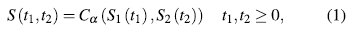
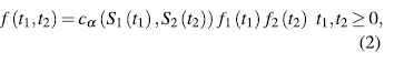
where a represents the dependency parameter bet- ween T1 and T2.
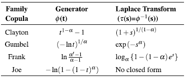
We introduce the Archimedean family of copulas, because is the most used copula family. A bivariate distribution belonging to the family of Archimedean copula models has the representation(2)
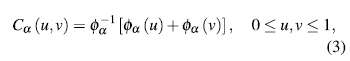
where Φ is a convex and decreasing function such that Φ≥0,Φ(1)=0. , f (1)= 0. The Φ function is named generator of the Ca copula and the inverse of the generator, Φ, is the Laplace transform of a latent variable denoted as γ, which induces the dependency a. Thus, the selection of a generator results in several families of copulas. In table 1, we show the forms for bi-variate survival functions in three Archimedean copula families. Additionally, in table 2, we show the generators and the Laplace transform for the considered families.
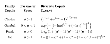
In this work several copulas of the archimedian class are used. This class groups a large number of copula families with simple analytical properties [9]. Archimedian copulas also can describe a great diversity of dependency structures [10]. In addition, Gaussian copula is included as an alternative frequently used in literature. The Gaussian copula is a one-parameter family for pairs of random variables (u; v). It takes the form [11]:
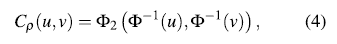
where p is the correlation coefficient, p = corr(u,v), Φ2 is the bivariate normal distribution function and Φ is the univariate normal distribution function.
2.1. Kendall's T
The Kendall's T is perhaps the best alternative to use instead of linear correlation coefficient as a measure of dependence for variables that do not belong to the elliptical family [12].
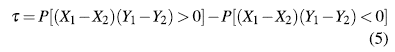
Let (Xi,Yi) and (X2,Y2) be a bivariate random sample of a joint and continuous distribution function H(X,Y ). Then Kendall's T is defined as the probability of concordance less the probability of discordance [3]:
Theorem 2.1. [13] Property of invariance of Kendall's T. Let (X1,Y1) y (X2,Y2) be a bivariate random sample of a joint and continuous distribution function, H(X,Y), let g and h two increasing functions, then T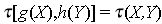 . In [13] can be seen the proof of this theorem.
As Kendall's T is invariant to strictly increasing transformations, the following theorem provides an expression of this parameter in terms of copulas.
Theorem 2.2. [14] LetX, Y continuous random variables whose copula is C. Then Kendall's X for Xand Y, T (X,Y) is given by:
3. GRAPHICAL METHODS FOR DETECTING DEPENDENCE
In this section both graphical methods that will be seen throughout this work are defined.
3.1.  -plot
-plot
The -plot was originally proposed by [4]. Its construction is based on the -square statistic for independence.
Let (X1,Y1) (Xn,Yn) be a bivariate random sample of a joint and continuous distribution function, H (X,Y ), and let I (A) be the indicator function of the event A. For each observation (xi, y) the following procedure is performed: [15]
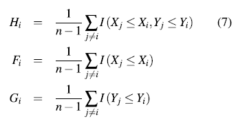
None of these quantities exclusively depend of the observations ranks. [4] proposed to plot the pairs  where:
and  for
for  .
.
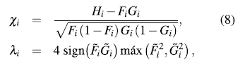
 is a measure of distance from the observation (Xi,Yi) to data center [15].
All values of λ
i
must be in the interval [1-1;] [14]. The  -plot is a scatter-plot of the pairs
  , i = 1,...,n. If the data constitute a bivariate sample with independent continuous marginals, the values of λi will be evenly distributed. However, if X and Y are associated, the values of λi will tend to form groups, in particular, positive values of λi indicate that Xi and Yi are relatively larger or smaller (at the same time) than the median, while negative values of correspond to Xi and Yi located on opposite sides with respect to their median [15].
The horizontal lines on the graph are given by 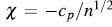 and
and  where c
p
is selected so that approximately 100p % of the pairs
where c
p
is selected so that approximately 100p % of the pairs  are between the two horizontal lines. For p = 0.90, 0.95, 0.99 the values of c
p
are 1.54, 1.78 y 2.18, respectively [4]. Using the Monte Carlo method you can calculate other c
p
values. It is recommended to draw only those pairs such
are between the two horizontal lines. For p = 0.90, 0.95, 0.99 the values of c
p
are 1.54, 1.78 y 2.18, respectively [4]. Using the Monte Carlo method you can calculate other c
p
values. It is recommended to draw only those pairs such 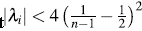 in order to avoid misleading observations [14].
3.2 K-plot
The K-plot (Kendall-plot) was created by [5]. This tool is based on the ranks of observations using the integral transformation of multivariate probabilities, producing a similar graph to conventional Q-Q plot [15].
Let (X 1 ,Y 1 ),... , (X n ,Y n ) be a random sample of a joint and continuous distribution function, H (X,Y). To build the K-plot we proceed as follows:
For each 1 ≤ i ≤ n compute H i (as in the
 - plot).
Sort the H i values such that
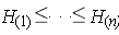
Plot the pairs (Wi:n , H(i)), where Wi:n is the expectation of the ith order statistic in a sample of size n, which is calculated as follows:
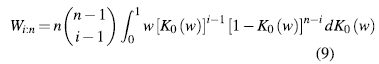
with
When the scatter plot of H(i) against Wi:n moves away from the diagonal, then there is an indication of a functional dependence between the two variables involved.
4. SIMULATION STUDY
In this section we present a simulation study to evaluate the development of the proposed graphical methods. In particular, we want to study the effect of some factors that can affect the performance of the dependence graphs such as: dependence level, sample size and the chosen copula to construct the bivariate function. In addition, we show the implementation of  -plot and K-plot through the package CDVine of R [16].
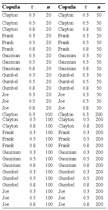
The scope of the study is intended to cover several scenarios, where the scatter plot is compared with the -plot and K-plot, for which the sample size in 20, 50, 100 and 200 is varied, and the dependence parameter values (t Kendall) of 0.3, 0.5 and 0.8 were considered. In addition, for the data generation Clayton, Frank, Gaussian, Gumbel and Joe copulas were used.
In total 60 simulation scenarios were obtained, which are summarized in the following table:
4.1 Analysis of Results
In the following section the results of the simulation study are presented. The main objective is to evaluate the performance of graphics to detect dependence under the scenarios described in the previous section.
4.1.1 Sample size n = 20
Figures 1 to 5 show the graphics performance when the sample size is n = 20 and varying the parameter dependence t, under the considered copula families.
In figures 1 to 5 with n = 20, the behavior of graphics to detect dependence is similar in all simulated copulas. When % = 0.3, the  -plot and K-plot provide similar results to the traditionally used graph: the scatter plot. In this case the three graphics fail to detect dependencies between variables. When the dependence parameter t increases to values of 0.5 and 0.8, again the three graphs behave similarly, all fail to detect such dependence between variables for all simulated copulas. In the case of the -plot with t = 0.5 and t = 0.8, most points fall outside the bands in all simulated copulas, indicating a clear dependence between variables. In the case of the graph K-plot, for t = 0.5 and t = 0.8 the points consistently fall away from the diagonal, which indicates dependence.
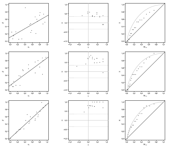
Figure 1 Scatter-plot (left), X-plot (center) and K-plot (right) for n = 20 using the Clayton Copula with t = 0.3 (top), t = 0.5 (medium) and t = 0.8 (bottom)
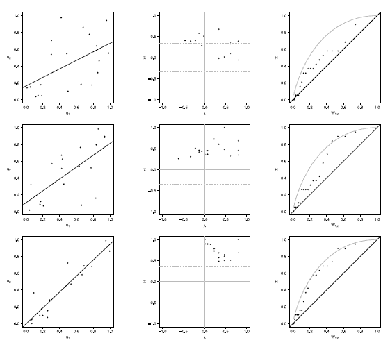
Figure 2 Scatter-plot (left), X-plot (center) and K-plot (right) for n = 20 using the Frank Copula with t = 0.3 (top), t = 0.5 (medium) and t = 0.8 (bottom)
Figure 3 Scatter-plot (left), X-plot (center) and K-plot (right) for n t = 20 using the Gaussian Copula with t =0.3 (top), t = 0.5 (medium) and t = 0.8 (bottom)
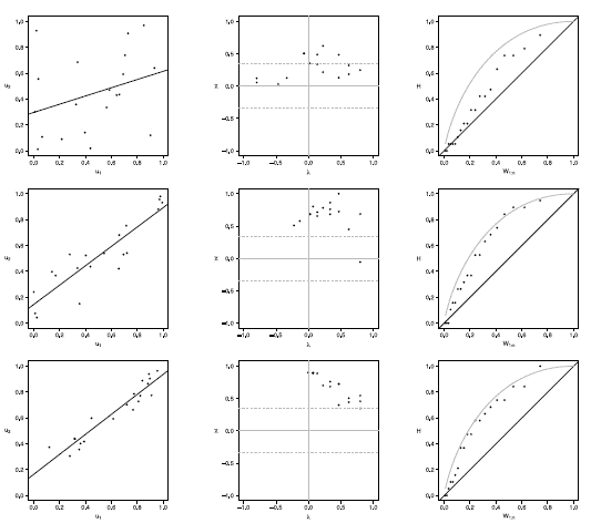
Figure 4 Scatter-plot (left), X-plot (center) and K-plot (right) for n = 20 using the Gumbel Copula with t = 0.3 (top), t = 0.5 (medium) and t = 0.8 (bottom)
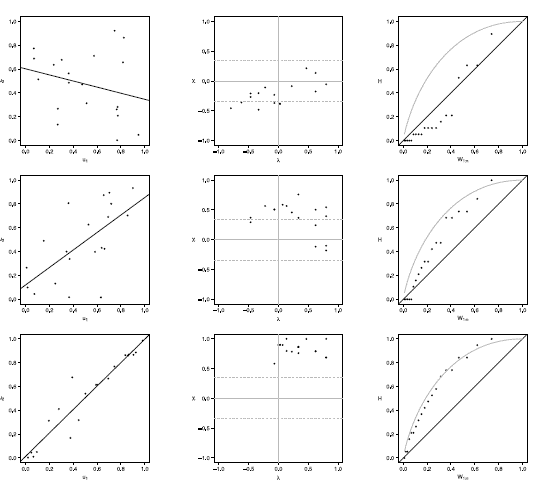
Figure 5 Scatter-plot (left), X-plot (center) and K-plot (right) for n = 20 using the Joe Copula with t= 0.3 (top), t = 0.5 (medium) and t = 0.8 (bottom)
4.1.2 Sample size n = 50
Figures 6 to 10 show the graphics performance when the sample size is n = 50 and varying the parameter dependence t, under the considered copula families.
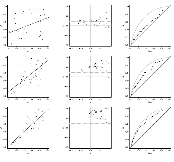
Figure 6 Scatter-plot (left), X-plot (center) and K-plot (right) for n = 50 using the Clayton Copula with t = 0.3 (top), t = 0.5 (medium) and t = 0.8 (bottom)
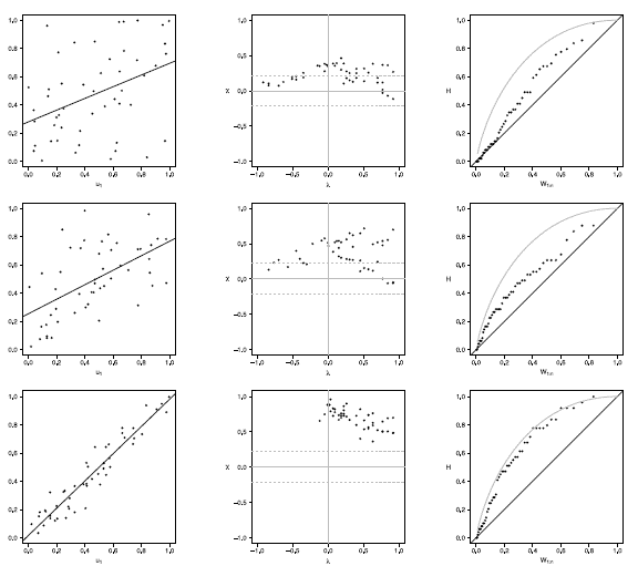
Figure 7 Scatter-plot (left), X-plot (center) and K-plot (right) for n = 50 using the Clayton Copula with t = 0.3 (top), t = 0.5 (medium) and t = 0.8 (bottom)
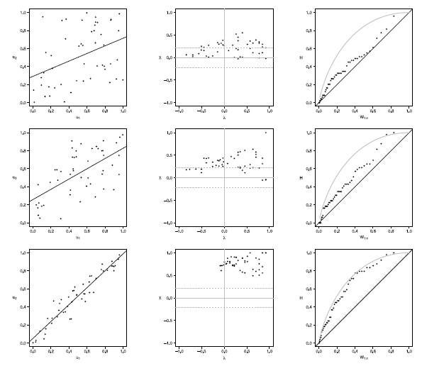
Figure 8 Scatter-plot (left), X-plot (center) and K-plot (right) for n = 50 using the Clayton Copula with t = 0.3 (top), t = 0.5 (medium) and t = 0.8 (bottom)
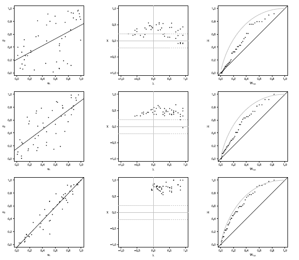
Figure 9 Scatter-plot (left), X-plot (center) and K-plot (right) for n = 50 using the Clayton Copula with t = 0.3 (top), t = 0.5 (medium) and t = 0.8 (bottom)
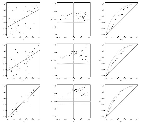
Figure 10 Scatter-plot (left), X-plot (center) and K-plot (right) for n = 100 using the Clayton Copula with t = 0.3 (top), t = 0.5 (medium) and t = 0.8 (bottom)
In figures 6 to 10 with n = 50,  -plot and K-plot provide slightly different results when T = 0. 3 compared to the previous case with n = 20. In this case, with the Clayton, Frank, Gumbel and Joe copulas in -plot about half of the points are outside the bands and around the half of the data is within the bands which indicate a low dependence between the random variables. The K-plot for Clayton and Gaussian copulas does not detect dependence between the variables because the points are very close to the diagonal. In the case of the Frank, Gumbel and Joe copulas is observed that at the beginning, the points are near the diagonal but the rest of points are consistently going away which it would be a sign of low dependence between the variables. With T = 0.3 scatter plot does not detect dependence between the variables in any of the cases. When the parameter of dependence T increases to values of 0.5 and 0.8 the three graphs behave similarly, all fail to detect such dependence between variables for all simulated copulas. Notice that in the -plot with T = 0.5 and T = 0.8 most points fall outside the bands in all simulated copulas, which indicates a clear dependence between the variables, while in the K-plot with T = 0.5 and T = 0.8 the points consistently fall away from the diagonal, which indicates dependence.
4.1.3 Sample size n = 100
Figures 11 to 15 show the graphics performance when the sample size is n = 100 and varying the parameter dependence T, under the considered copula families.
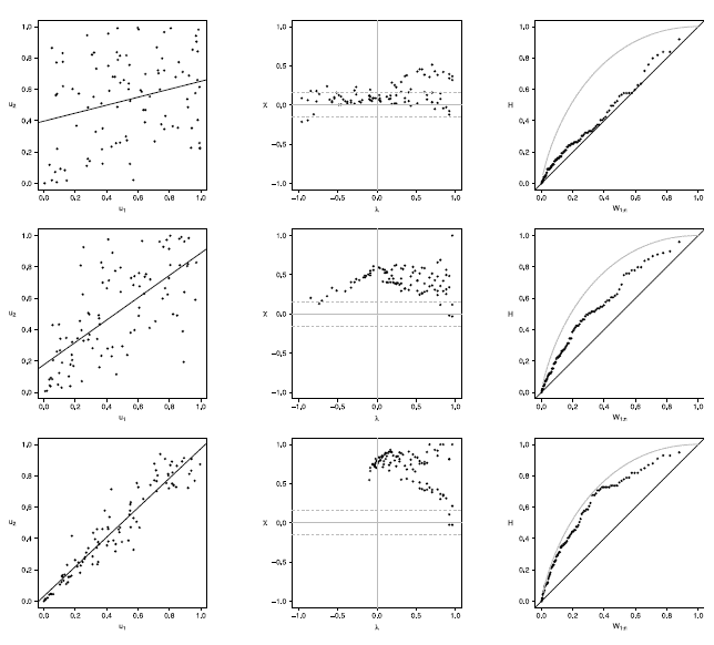
Figure 11 Scatter-plot (left), X-plot (center) and K-plot (right) for n = 100 using the Clayton Copula with t = 0.3 (top), t = 0.5 (medium) and t = 0.8 (bottom)
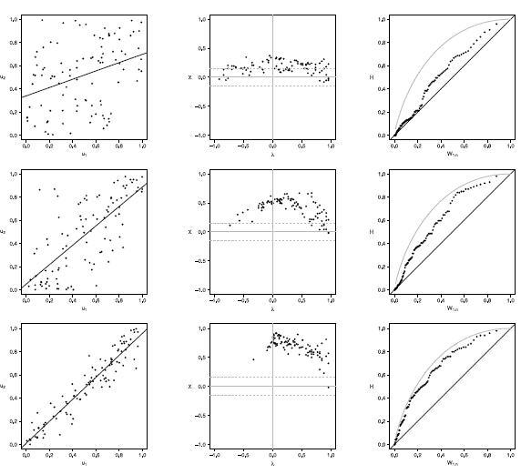
Figure 12 Scatter-plot (left), X-plot (center) and K-plot (right) for n = 100 using the Clayton Copula with t = 0.3 (top), t = 0.5 (medium) and t = 0.8 (bottom)
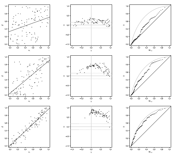
Figure 13 Scatter-plot (left), X-plot (center) and K-plot (right) for n = 100 using the Clayton Copula with t = 0.3 (top), t = 0.5 (medium) and t = 0.8 (bottom)
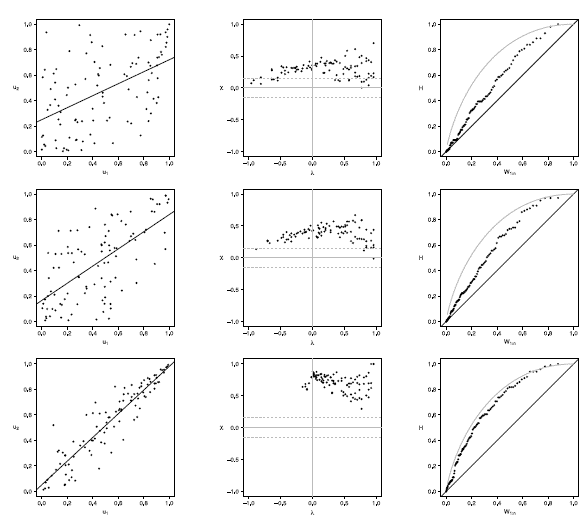
Figure 14 Scatter-plot (left), X-plot (center) and K-plot (right) for n = 100 using the Clayton Copula with t = 0.3 (top), t = 0.5 (medium) and t = 0.8 (bottom)
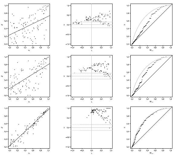
Figure 15 Scatter-plot (left), X-plot (center) and K-plot (right) for n = 100 using the Clayton Copula with t = 0.3 (top), t = 0.5 (medium) and t = 0.8 (bottom)
The case with n = 100 is presented in figures 11 to 15. In the  -plot with T = 0.3, for all simulated copulas, about half of the points remain outside the bands and about half of the data is within the bands, which indicates a low dependence between the random variables. The K-plot for Clayton copula does not detect dependence between the variables because the points are very close to the diagonal. In the Frank, Gumbel, Gaussian and Joe copulas is observed that at the beginning, the points are near the diagonal but the rest of points are consistently going away which it would be a sign of a low dependence between the variables. With T = 0.3 the scatter plot does not detect dependence between the variables in any of the cases. When the parameter of dependence Tincreases to values of 0.5 and 0.8 the three graphs behave similarly and all of them fail to detect such dependence between the variables for all simulated copulas. In the case of the -plot with T = 0.5 and T = 0.8 most points fall outside the bands in all simulated copulas, which indicates a clear dependence between the variables. In the case of K-plot with T = 0.5 and T=0.8 the points consistently fall away from the diagonal, which indicates dependence.
4.1.4. Sample size n = 200
Figures 16 to 20 show the graphics performance when the sample size is n = 100 and varying the parameter dependence t, under the considered copula families.
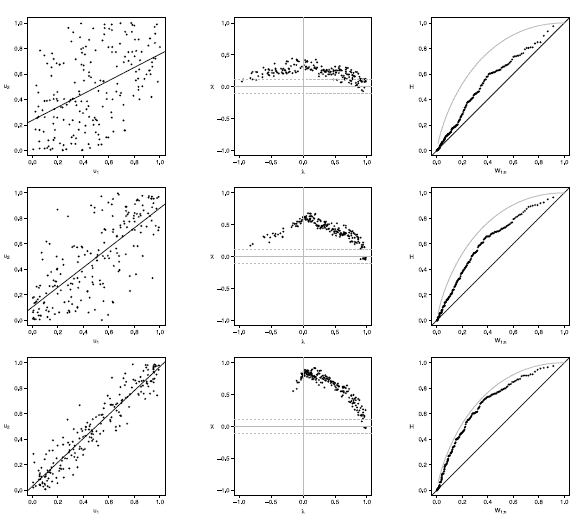
Figure 16 Scatter-plot (left), X-plot (center) and K-plot (right) for n = 200 using the Clayton Copula with t = 0.3 (top), t = 0.5 (medium) and t = 0.8 (bottom)
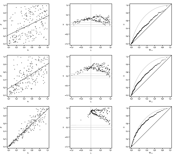
Figure 17 Scatter-plot (left), X-plot (center) and K-plot (right) for n = 200 using the Clayton Copula with t = 0.3 (top), t = 0.5 (medium) and t = 0.8 (bottom)
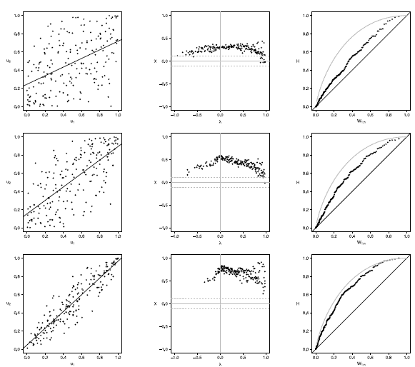
Figure 18 Scatter-plot (left), X-plot (center) and K-plot (right) for n = 200 using the Clayton Copula with t = 0.3 (top), t = 0.5 (medium) and t = 0.8 (bottom)
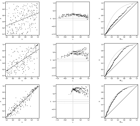
Figure 19 Scatter-plot (left), X-plot (center) and K-plot (right) for n = 200 using the Clayton Copula with t = 0.3 (top), t = 0.5 (medium) and t = 0.8 (bottom)
Figure 20 Scatter-plot (left), X-plot (center) and K-plot (right) for n = 200 using the Clayton Copula with t = 0.3 (top), t = 0.5 (medium) and t = 0.8 (bottom)
Figures 16 to 20 show the case of n = 200, in Joe copula the X-plot with t = 0.3 about half of the points are outside bands and about half of the data is within the bands, which indicates a low dependence between the random variables. With the Clayton, Frank, Gumbel and Gaussian copulas X-plot detects dependence between the variables since most points fall outside the bands. The K-plot with all simulated copulas is observed that at the beginning, the points are near the diagonal but the rest of points are consistently going away, which it would be a sign of a low dependence between the variables. With t = 0.3 scatter plot does not detect dependence between the variables in any of the cases, which makes the Z-plot and K-plot good alternatives for detecting dependence when n is large even when the dependence is low. When the parameter of dependence t increases to values of 0.5 and 0.8 the three graphs behave similarly and all fail to detect such dependence between the variables for all simulated copulas. In the case of X-plot with % = 0.5 and t = 0.8 most points fall outside the bands in all simulated copulas, which indicates a clear dependence between the variables. In the case of K-plot for t = 0.5 and t = 0.8 points are consistently away from the diagonal, which indicates dependence.
5. APPLICATION TO REAL DATA
In this section, we present an application of graphical methods to detect dependence previously shown to insurance data [17], comparing the results obtained with the traditional scatter plot. A random sam Application to real data
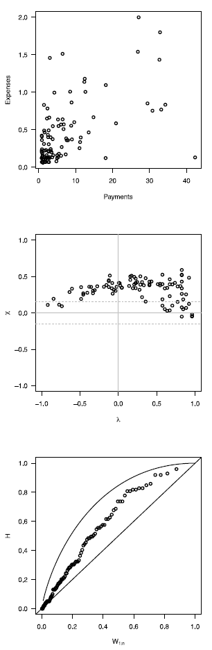
In this section, we present an application of graphical methods to detect dependence previously shown to insurance data [17], comparing the results obtained with the traditional scatter plot. A random sam ple of size 100 of the data was used, consisting of payments and expenses of claims (in millions of pesos) in property insurance policies [17]. The results are shown below:
In figure 5 it can be observed that the Chip-lot and the K-plot are able to detect dependence between the two variables used (payments and expenses of claims), in particular, the Chi-plot shows a clear dependence, since most of the observations are outside of the bands. In addition it can be affirmed that the parameter of dependence is high, due to the form of the graphs obtained. In this case the scatter plot is not as clear and precise as the proposed methods.
6. CONCLUSIONS
Graphical methods for detecting dependency studied in this work provide a useful alternative tool to scatter plot traditionally used, since they are simple to interpretate and clearly show if there is dependence between the variables studied.
In simulated scenarios with a small sample size (n = 20) the Z-plot and the K-plot achieve the same results as the scatter plot, that is, when the parameter of dependence is low the three methods fail to detect dependence, while under moderate or high dependence the three methods can detect such dependences.
In the simulated scenarios with sample sizes moderate to large (n > 50) and under low dependence, the Z-plot and the K-plot detect such dependence in at least some of the studied copulas families while the scatter plot does not in any of the cases. On the other hand when the parameter of dependence is moderate to high the three methods can detect such dependences.
In general, the Chi-Plot and K-Plot graphs have the advantage that by increasing the sample size, their performance improves and they manage to detect dependence even when the dependency parameter is T = 0.3, a result that is not achieved with the scatter plot, since it can not detect dependence when the dependency parameter is low even if the sample size is large. Additionally, the archimedian copulas have a better behavior than the Gaussian copula to detect dependence when the sample sizes are small.
In the application to real data presented in section 5, it can be observed that the X-Plot and the K-plot have a better performance than the scatter plot, since they could detect the dependence between the variables, which was not clear in the scatter plot analysis.

